
The Cake: A Case Study
Case Study by Eve Hocheng
Prototype
Summary
1. Overview
The Cake app, inspired by three girls' shared passion for health-conscious desserts during the pandemic lockdown, aims to redefine dessert consumption. It provides a community-centered platform for exploring, creating, and sharing quality treats. Users can browse, purchase from homemade sources, or become chefs themselves, exploring recipes tailored to dietary preferences and sharing their creations. Additionally, the app aims to explore sustainable packaging options, extending its branding and promoting sharing and sustainability.
2. Problem Statement
Many individuals indulge in treats to satisfy their cravings, however there is a significant challenge in finding reliable sources that offer affordable options catering to those with dietary restrictions or preferences.
3. User
Our target users are individuals residing in metropolitan cities, mid-size cities, or community-oriented locations. They enjoy indulging in treats occasionally but may lack the time to prepare everything themselves. They are conscious about their treat consumption and seek convenient options that align with their dietary preferences and busy lifestyles.
4. Role and Responsibility
Creation of the product from conceiving the concept to realization through multiple methods of development and ideation. Methods of development and ideation process as below:
-
empathize with users and define problem statement
-
craft sketches to brainstorm product ideas
-
ideate low/ high fidelity wireframes through hand sketches and Figma
-
user interview/user tests
-
refine/make iterations of product based on user feedback
-
create user interface / high fidelity mockup
-
create interactive prototype and conduct tests to ensure continuous function
-
explore branding strategies on packaging and sustainability concept
5. Main Challenges
There were three main challenges in the process of developing this product:
-
Developing a unique platform for food sharing and promoting sustainability is common in the current market, to balance innovation and familiarity and to stand out from conventional review-sharing platforms like Google Maps is difficult.
-
Obtaining real user feedback poses a challenge as the product is in its early stages, emphasizing the importance of gathering insights through market deployment for further refinement.
6. Working Process and Actions Taken
The iterative design process involved evaluating and refining the product through multiple rounds of testing to ensure natural usability. High-fidelity mockups and interactive prototypes garnered more feedback, facilitating a refined user experience. Guiding users through test goals and prototype navigation in Figma enhanced engagement and ease of use. Post-test discussions facilitate overall feedback and identified roadblocks, with user suggestions informing product improvements. The final product reflects consolidation of user testing results aimed at achieving seamless navigation for users.
7. Outcome
The outcome is an app 'The Cake' prototype, where users can navigate 4 functions:
1. Sign up an account with The Cake community
2. Browse, add items to shopping card, complete a purchase, choose delivery options and delivery tracking
3. Upload creation for listing, fill in item information with interactive filter for key ingredients
4. View profile and past orders
5. Branding strategies for sustainable packaging on demand
See prototype and package branding below:
8. Takeaways
The initial challenge has been largely addressed with room for improvement, with the process addressing multiple key user testing results and the main challenge. The final product represents the culmination of the current progress, with continuous development underway and exploration of branding strategies for the future.
The learning process for the UX Designer include various aspects, such as button placement and flow design to enhance user experience. It is a continuous effort, extending over months and evolving to enrich the product sustainably with advancing technology.
To see the complete case study in detail, please scroll down:
Case Study Details below
The Product
The Cakes is a dessert ordering application that addresses the growing demand for top-tier, dietary-conscious confections that is often missing at typical marketplaces. This initiative was inspired by three girls, who share passion for crafting exceptional, health-conscious desserts. Their story began during the pandemic lockdown, a period that prompted them to challenge the prevailing belief that desserts inherently lead to health problems due to high sugar and butter content.
The commitment and passion to create healthy dessert lasted well over the lockdown period, and the idea was to expand beyond personal enjoyment. Sharing the exquisite creations with family, friends and neighbors became wonderful culinary exchange.
This endeavor served as the catalyst for the development of The Cakes app, a community-centered dessert ordering platform. The primary objective is to provide a platform for individuals who share a devotion to quality and health-conscious desserts. The app allows users to explore, create, share, and savor delicious confections with their choices of ingredient and dietary preferences, uniting like-minded enthusiasts and promoting a fresh perspective on dessert consumption.
In essence, The Cakes is a serious response to the scarcity of high-quality, dietary-conscious desserts in conventional markets. By facilitating the production and enjoyment of delectable yet health-conscious sweets, this initiative strives to redefine the dessert experience, offering a platform where quality and health go hand in hand.
The Goal
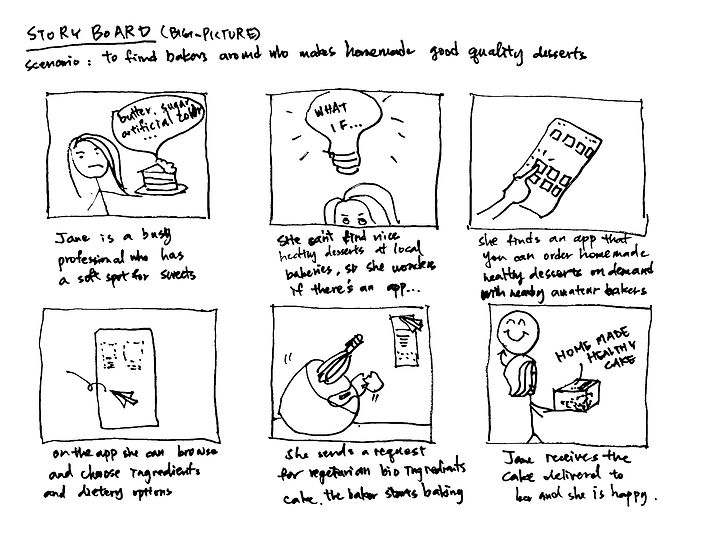
The goal of this app is to create a convenient platform for individuals seeking to easily discover, filter, and order high-quality homemade desserts, providing a delightful daily escape for busy individuals in the modern world.
The storyboard below shows the big-picture concept and inspiration for this product:

Understanding the User
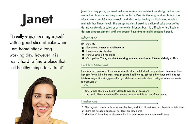
To gain insights into the user base, I conducted interviews and developed empathy maps. The key demographic identified through this research comprises working adults who share a passion for desserts but struggle to find high-quality options due to their busy schedules. While time constraints align with our initial assumptions regarding The Cakes' customer base, our research also unveiled that limited dessert options in everyday life play a significant role in this struggle.
Beyond time-related challenges, users face a spectrum of other issues, such as personal obligations, varying interests, or specific challenges that hinder their ability to access desserts in-person. These findings provide a holistic understanding of the diverse user needs and preferences, which are invaluable in designing a user-friendly dessert ordering experience.
User Research: Pain Points
Accessibility
Grocery locations such as supermarkets, grocery stores and delis often don’t have vegan, organic or healthy ingredients dessert options.
Information
There are no central platforms for gathering information for where people can find their preferred dessert products.
Time
Modern life is busy for individuals, there is not enough time to filter and select the desired types of dessert products.
Price
Vegan, organic and other specific options of products are often pricy and labeled as high-end, resulting in higher price for customers who may not be able to afford them.
Personas

User Journey Map
Mapping Janet’s user journey revealed how helpful it would be for
users to have access to a dedicated app for ordering selected good quality dessert items

Paper Wireframe
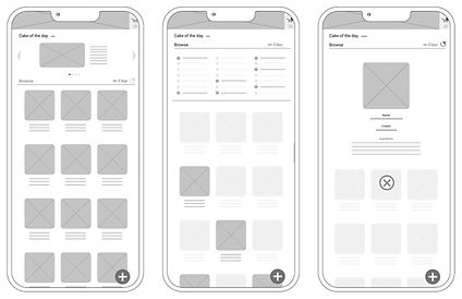
The process of sketching multiple versions of each app screen on paper ensures that the elements incorporated into the digital wireframes were ideally tailored to alleviate user concerns. In the case of the home screen, the focus was on creating a simple, uncluttered menu layout that streamlines product browsing, along with a prominent header banner to underscore the overarching product branding image. This approach was chosen to enhance the user experience and be efficient with time while navigating the app.

Digital Wireframes
Easy navigation was a key user need to address in the designs in addition to equipping the app to work with assistive technologies.

Low-Fidelity Prototype
Using the completed set of digital wireframes, I created a low-fidelity prototype. The primary user flow I connected was browsing and ordering dessert items, so the prototype can be used in a usability study.

Usability Study: Findings
I conducted two rounds of usability studies. Findings from the first study helped guide the designs from wireframes to mockups. The second study used a high fidelity prototype and revealed what aspects of the mockups needed refining.
Round 1 Findings
-
Straight forward menu page of items array is easy to read.
-
Users would like to select multiple items to add to shopping cart.
-
Main menu on top right and bottom left and right are partially covered from the curve corner design of device.
-
Users want to have full control over adjustments of delivery time and date.
Round 2 Findings
-
Users enjoy the simplicity of the app.
-
Users think There should be a location filter for understanding the distance to where the items was made.
-
Images and buttons are too small
Takeaways from Usability Studies
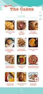
Before usability studies, I also had the cake of the day section unproportionally larger than the rest of the page, after usability studies, I shrunk this section and put more emphasis on the overview of items.
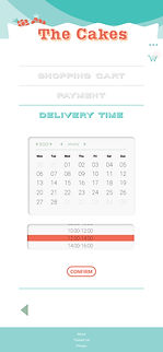
Another important point during the usability study shows that the contrasting colors distract the users, so the final mockup included adjustment of colors, using less saturated colors for brand tone, and only action buttons are highlighted in orange.




High Fidelity Mockup and Prototype
Early design showed a lot of buttons for going back and forth, but without an option for selecting multiple items. After the usability studies I eliminated unnecessary arrows and buttons, and added the option to select multiple items on the first page.

Color Palette, Sticker Sheet
By using a consistent color scheme with a variety of button components, the prototype is made easy to use and adjust. Using Variations help keep elements in place and create easy options.

Prototype
The high-fidelity prototype presented cleaner user flows for selecting, previewing, and ordering items to checkout, utilizing design systems, overlays and frames to simplify and unify the pages.
The design also met user needs for:
(1) Clear identification on next steps in the app.
(2) Clear layout on check out page for users to have control over delivery date and time.
Try it out Here!
Prototype
Extending the Brand
After revising the prototype many times, I took the case study to a next level of expanding the brand into how sellers/ buyers would use the product. The simple illustration branding can be applied on different objects used for packaging the food being sold on this platform. Offering minimalistic and characteristic branding will help advertising the brand, and give sustainability a new meaning for promoting idea exchanges through food.

Product Website Landing Page Preview


Thank You!

